
Public debt levels are close to record highs
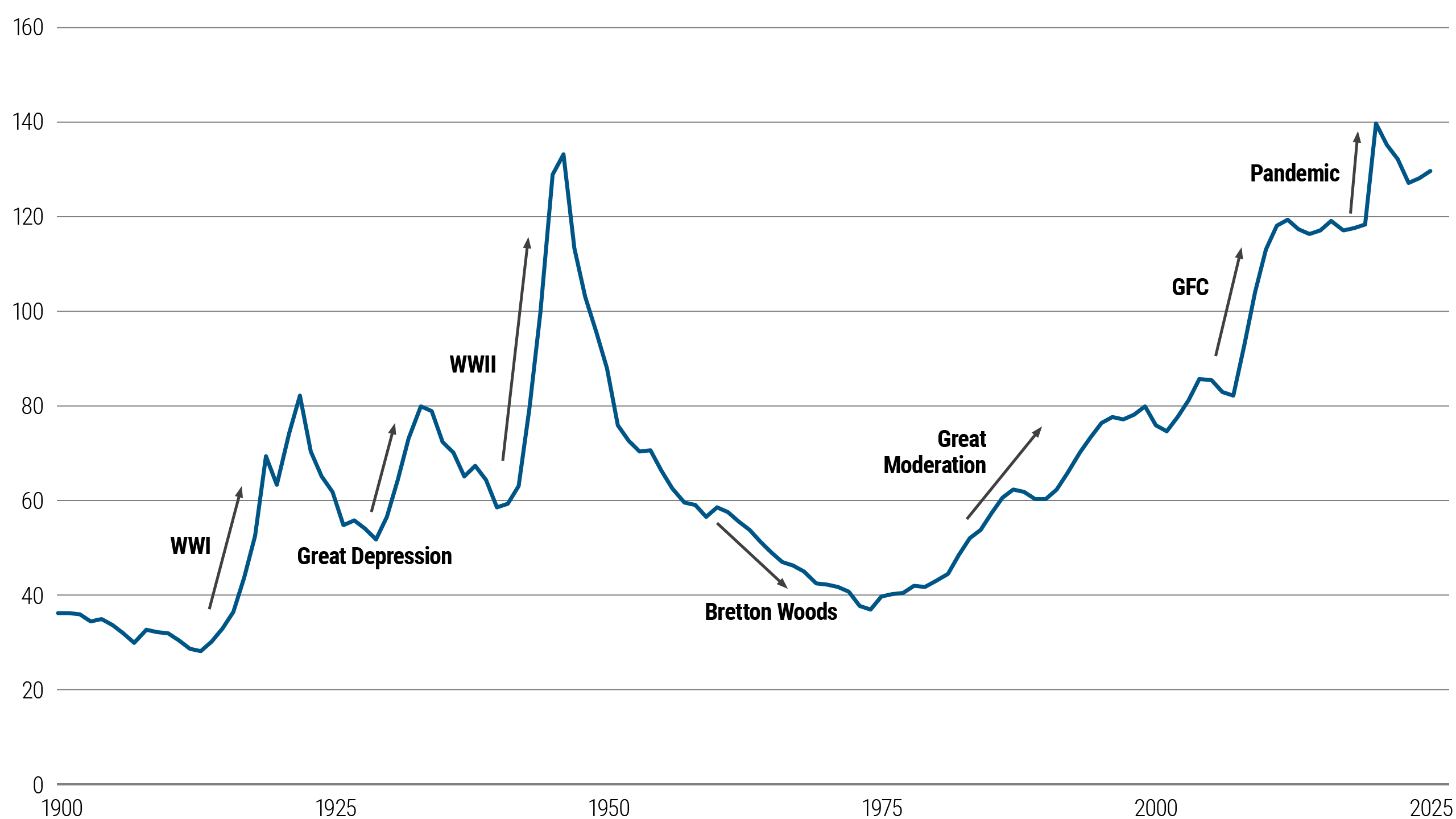
Public debt levels among G7 countries historically have fluctuated. They increased sharply during major crises – World War I, the Great Depression, and World War II – and then diminished during the postwar boom.
More recently, the global financial crisis (GFC) and the COVID-19 pandemic pushed debt ratios to new highs. Today, G7 government debt remains close to the peak levels seen at the end of World War II, highlighting the dramatic scale of public borrowing.
Elevated interest rates relative to the post-GFC years add to the challenge of servicing high debt levels.
G7 government debt (% of GDP)
Source: IMF Public Finances in Modern History, JST macro-history database (GDP weights), IMF WEO, PIMCO calculations as of June 2025. Note: Chart plots debt-to-GDP across G7 countries, GDP-weighted. Last data point is 2025.
U.S. debt trajectory is unsustainable under current policy
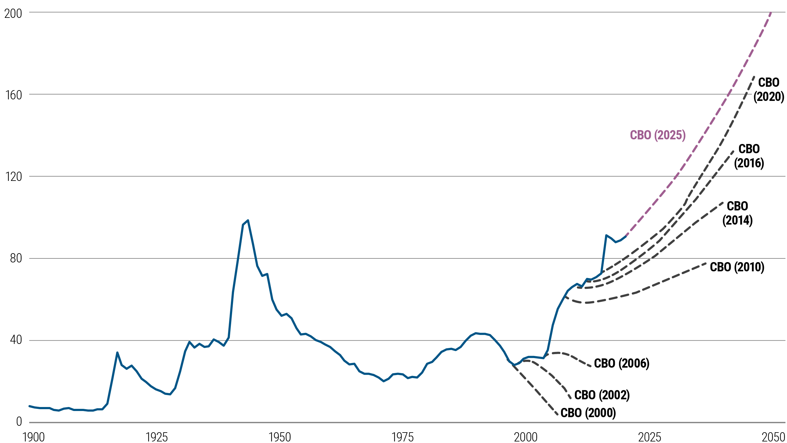
In particular, the U.S. government’s debt trajectory has been increasing for over a decade. Projections from the U.S. Congressional Budget Office (CBO) show a rise in debt levels, with each new forecast painting a steeper path.
The latest projections suggest that by 2050, U.S. debt could approach nearly 200% of GDP if unchecked. Without changes to current policies, U.S. debt is on an ever-increasing path.
U.S. debt held by the public (% of GDP)
Source: CBO Long-Term Budget Outlook as of March 2025 adjusted for the extension of the 2017 Trump tax cuts; PIMCO calculations as of June 2025. Note: Chart plots CBO projections of U.S. debt at different times. U.S. debt held by the public is smaller than total government debt.
U.S. dollar almost certain to remain dominant reserve currency given lack of alternatives
Despite the unsustainable debt path, the U.S. dollar is almost certain to maintain its position as the world’s dominant reserve currency over the next five years.
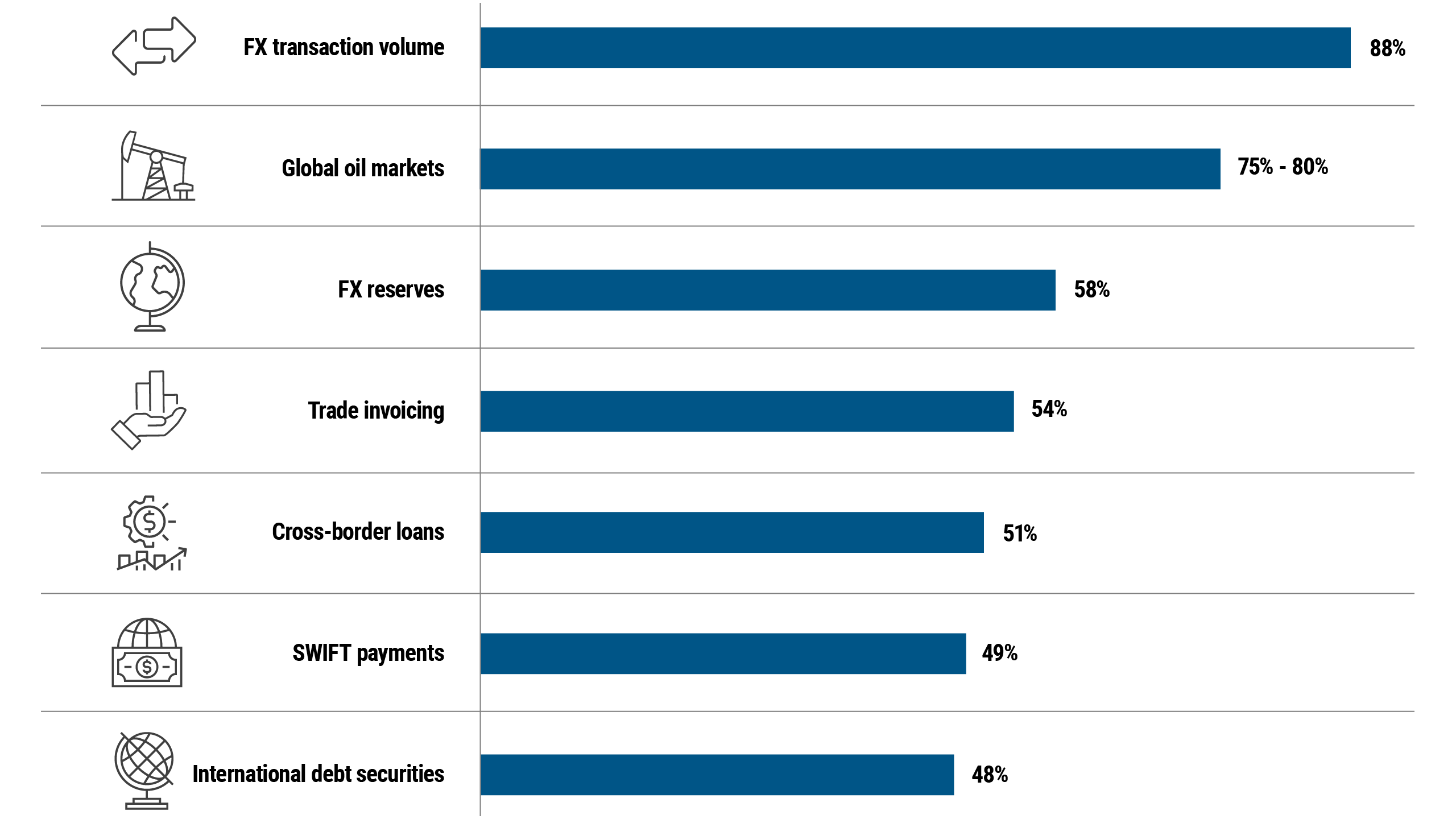
Its widespread use in global trade and finance, combined with the lack of viable alternatives, supports this status. For example, the dollar accounts for approximately 88% of global foreign exchange transaction volume, reflecting its central role in international markets and reinforcing its resilience amid fiscal concerns.
U.S. dollar’s share of global markets
Source: From top to bottom, the sources (and latest data in parentheses) are BIS Triennial Central Bank Survey (2022); PIMCO estimate (2024); IMF’s Currency Composition of Official Foreign Exchange Reserves (3Q 2024); BIS “Revisiting the international role of the US dollar” (2022); BIS Locational Banking Statistics (4Q 2024); Society for Worldwide Interbank Financial Telecommunications (SWIFT) (March 2025); BIS Debt Securities Statistics (4Q 2024)
Rising interest payments may eventually prompt U.S. fiscal consolidation
Additionally, U.S. debt won’t necessarily remain unchecked.
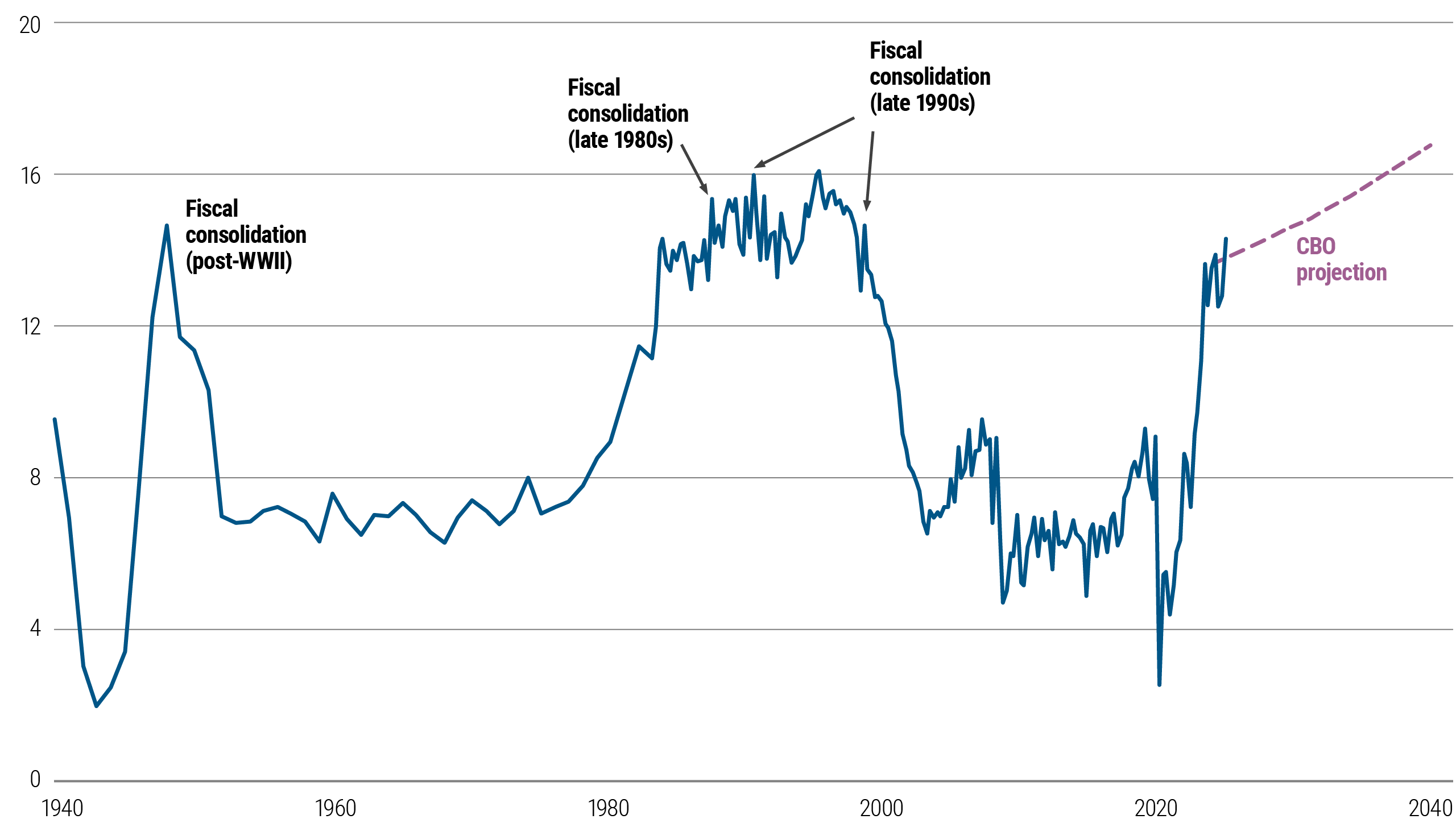
As debt levels rise, the government’s interest payments rise too, and these payments have increased sharply as a share of total federal outlays. Historically, this has often led to fiscal consolidation efforts, as seen after World War II and during the late 1980s and 1990s.
While current debt projections are high, these historical episodes indicate that rising interest costs may eventually encourage policymakers to tighten fiscal policy to stabilize debt dynamics.
U.S. government interest payments (% of total outlays)
Source: U.S. Treasury, CBO projections from March 2025, PIMCO calculations as of June 2025. Note: Actual data (quarterly) up until 1Q 2025; annual projections thereafter.
Rising debt (loosely) associated with a higher term premium
With all this backdrop, it is important to note a faint but observable relationship between increases in debt-to-GDP ratios (excluding Federal Reserve holdings) and the U.S. 10-year Treasury term premium – i.e., the extra yield investors demand for holding longer-term bonds.
As government debt rises, the term premium tends to increase, as investors demand more compensation to hold longer-term bonds relative to cash and short-term bills.
For asset managers, this dynamic suggests that rising public debt could lead to a steeper yield curve that affects the pricing of fixed income assets.
U.S. 10-year term premium valuation vs. debt
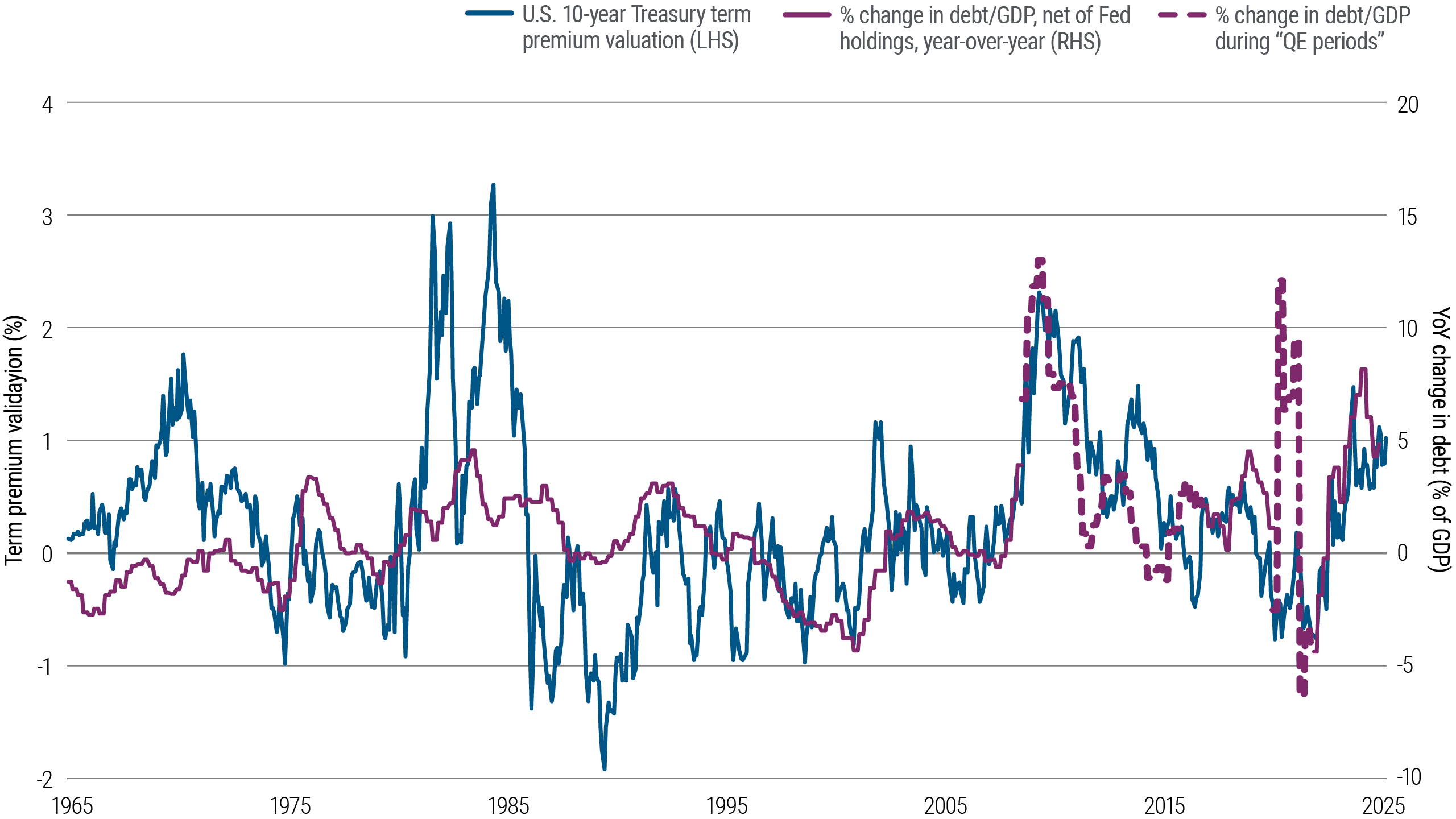
Source: PIMCO calculations as of June 2025. Note: U.S. 10-year term premium valuation equals the difference between the 10-year U.S. Treasury yield and its fair value. The fair value of the 10-year Treasury equals expected inflation [Bloomberg survey, converging to Fed target] + expected real rate [Taylor rule, converging to 1% r* over time] + fair term premium [Higher with higher bond-equity covariance].


